Some businesses will do almost anything for publicity, clicks, or SEO juice.
![]() Several times a year a real eye brow-raising press release will arrive in Inside Imaging‘s in-tray, sent by a bubbly and wide-eyed third-party PR consultant who is under strict instructions to sell a positive message about an utterly useless initiative.
Several times a year a real eye brow-raising press release will arrive in Inside Imaging‘s in-tray, sent by a bubbly and wide-eyed third-party PR consultant who is under strict instructions to sell a positive message about an utterly useless initiative.
It’s remarkable to think how much money is poured into some of these marketing initiatives, and what otherworldly discussions are had among the team who bring them to life. It may be playing into the hands of the marketing department’s strategy, but some things are so cringworthy – so terrible – that it’s hard not to share.
Shutterstock’s 2020 Colour Trends Report.
‘Colour is a simple, yet powerful form of messaging. It portrays a wide range of emotions without so much as a word or image. Colour can highlight something important or just as easily disguise something insignificant. It can invoke the past, inform the present, and inspire the future. The role colour plays in our visual world is so absolute that its power is hard to overestimate.’ Who could argue?
This year the loud colours are back in, while pastels are on the way out. So set your cameras to HDR mode, folks, and turn the saturation up to 11.
Before introducing the three new colours that will rock your world in 2020, here’s a little about how Shutterstock made this groundbreaking discovery.
The micro stock agency sorted through its customer downloads and anaylsed ‘hundreds of billions of pixel data from all those images’. Four teams of scientists in white coats then worked in shifts around the clock to map each pixel to their closest hex code to determine which colours had the greatest growth. Of course they did.
‘Whether it’s a response to the minimalist obsession of recent years or a collective desire for self-expression, the idea that more is more has climbed to new heights. From fashion to fine arts, we’ve been seeing a shift from soft pastel colors to more sensational shades. Lavenders, tans, whites, and pinks are becoming passé while these three bold, saturated hues are on their way to fame in 2020.’
Let’s not waste any more time beating around the bush. All Inside Imaging readers need to know is that the three colours for next year are Lush Lava, Aqua Menthe, and Phantom Blue; aka orange, cyan, and dark blue.

Lush Lava (#FF4500), AKA orange, ‘this bold and fiery orange-red can’t help but demand attention’. Shutterstock is right. This is a badass popping colour that polite society would never bring home to meet the parents. It can be found hanging from certain types of citrus trees, dangerously close to active volcanoes, in a sunset, on Chinese lanterns, or hurled into someones face at the Holi Hindu colour throwing festival. Don’t expect any apologies from Lush Lava after being kicked to the curb and rinsed of all valuable belongings.

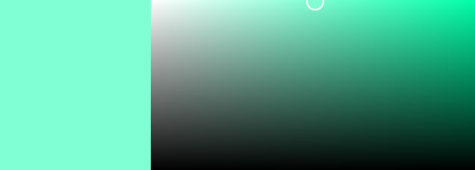
Aqua Menthe (#7FFFD4), once referred to cyan or turquoise by geologist enthusiasts, is ‘rooted in its sparkling semi-precious origins and reminiscent of luxurious, ocean-front shorelines, this bright hue evokes “look at me now” in a decidedly calm way’. Right. Aqua Menthe is basically a Bondi trust fund hipster who moved to Byron Bay to open a crystal shop and yoga studio. While at first glance Aqua appears deep and spiritually connected, he’s actually as shallow as the Broken Head rock pools and the hand-standing influencers who lounge in them.

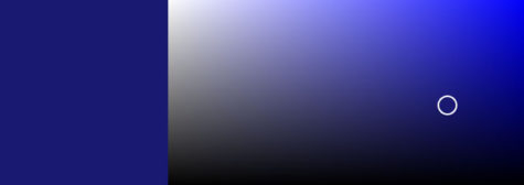
Phantom Blue (#191970), formerly known as dark blue, is the coolest dude of them all – mostly because she doesn’t constantly talk about herself. Deep, quiet, and calm. But make no mistakes, Phantom Blue has talent.
‘Darker tones communicate stability, trustworthiness, and sophistication—and Phantom Blue is no exception. While it’s striking on its own, it’s also the perfect companion for pops of bright, contrasting colors such as the aforementioned Lush Lava and Aqua Menthe. This versatility hasn’t escaped creatives in Australia, Germany, and Spain, where its popularity is booming.’
By the way, what do Australia, France, Japan, and Norway have in common? Glad you asked: Our favourite colour is magenta/lavender! So get this the program and embrace your inner magenta!


Be First to Comment