Libby Jeffrey is the co-founder and marketing manager of Momento Pro, an on-demand photo album printing platform.
As well as publishing great photo books, she also publishes a fine blog at Momento Pro. Libby shared the latest post with Inside Imaging, which has great tips for professional and up-and-coming photographers interested in producing a photo book.
Great layout and page design is not intuitive, a fact that has been proven by thousands of books that have passed through Momento’s print facility. We see many good designs but many would also benefit from using a few design fundamentals.
While photographers are more visually literate than most, the ability to compose within the frame of a photograph doesn’t always translate to composition within the frame of a double page spread. But if you want to create the most effective photo book, good design is critical. Depending on the purpose and budget for your book you can choose to design it yourself, or seek assistance from a professional. In either case, the design should always be driven by the purpose and intention of your book.
In this blog post we’ve collected design tips from local and international photo book creators, and some photo book design theory, to help you do your photographs justice. The focus is not on ‘commercially successful’ design but on design that is fit for the purpose of the book whether it be a personal photo project, a self published book, an artist book or other.
Design by you
Desktop publishing tools like InDesign, and template or drag-and-drop tool based software such as Momento Pro, have made it possible for anyone to layout books without needing to understand design theory or the printing process. While this has made it easier for photographers to self publish, it doesn’t always result in the best book design.
Design by a professional
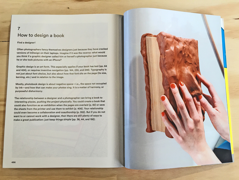
If you want the best possible design, we suggest you take the advice of Bruno Ceschel from Self Publish Be Happy and, ‘find a designer’, because, as Jorg Colberg reinforces in Understanding Photo Books: The Form And Content Of The Photographic Book, ‘photobooks made with the involvement of a designer simply make for much better books’.
Collaboration with a designer who is expert in publication layout, who knows how to work with text and images, understands how to read photography, or better still, is a photographer too, is the ultimate photo book designer. While they can’t save bad photos, they can enhance the story that the photographs are trying to tell.
The most important factor when choosing a designer is that they respect you and your book’s purpose, like Melbourne-based Heidi Romano who, ‘tries to leave her ego to the side while still bringing a voice to the boo. This respect allows the photographer and designer to avoid conflict and work together to achieve the best possible outcome.
Design assistance
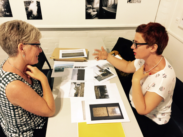
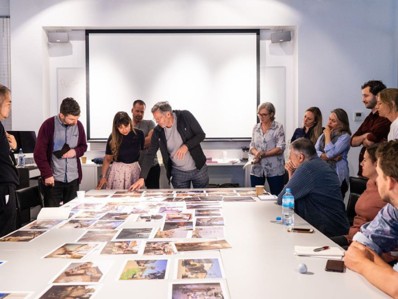
If you don’t feel you have the skills to design the book yourself, or your budget doesn’t allow for a professional designer, we suggest you still get input from experts, mentors and peers. This can be done through attending photobook reviews or workshops, and creating a draft design to show around or to submit to dummy book awards. Fresh eyes will always help refine your selection as they have no emotional attachment to particular photos, and need more reason to justify keeping images in the edit.
Design style
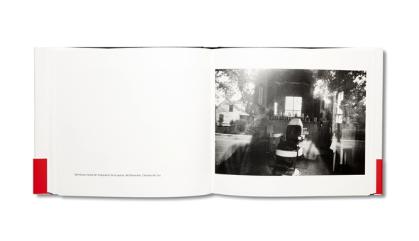
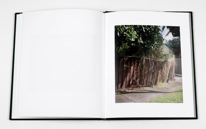
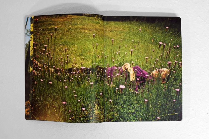
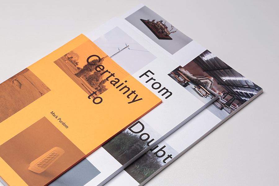
My limited research into photo book design theory has identified two dominant schools of thought: American Photobook Design and Dutch Photobook Design. American Photobook Design theory is best represented by the books – The Americans by Robert Frank and American Photographs by Walker Evans. Their style is simple, literal and linear, like a catalogue or an exhibition-in-a-book. Photography is king, and the design influence is minimal. White space is maximised, the book reads from front to back, generally with blank pages on the left and hero images on the right.

Dutch Photobook Design however is based on a closer collaboration between photographer and designer. The Interrogation by Donald Weber, designed by Teun van der Heijden, demonstrates its main characteristics. The design is more poetic and cinematic, resembling theatre in a book. It has movement, a non-linear sequence, is more likely to include creative typography and play with the physical form. Design and photography have equal status.
Now we’ll explore different design levers that can be employed in the creation of a photo book.

Editing + sequencing
Editing and sequencing are an art in and of themselves, and Dutch photo book designer Teun van der Heijden neatly explains their importance, ‘If you simply select the best 50 images in a series, it’s not an interesting book, because the tension in the photos is always the same. Like in a film or a novel, you have to build up to the tension and then you need to release the tension’. Read more from Teun on photo book design here.
Careful consideration and time, needs to be put into selecting the images for your book, and equal efforts needs to be given to their sequencing. Spacing and repetition can influence the pace and rhythm of the visual narrative, while white space and blank pages can act as visual punctuation, giving the reader a moment to reflect upon the book. As Ceschel advises, ‘Mostly, photobook design is about negative space – i.e., the space not occupied by ink – and how that can make your photos sing. It is a matter of harmony, or purposeful disharmony’.
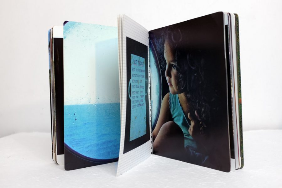
Pairing images
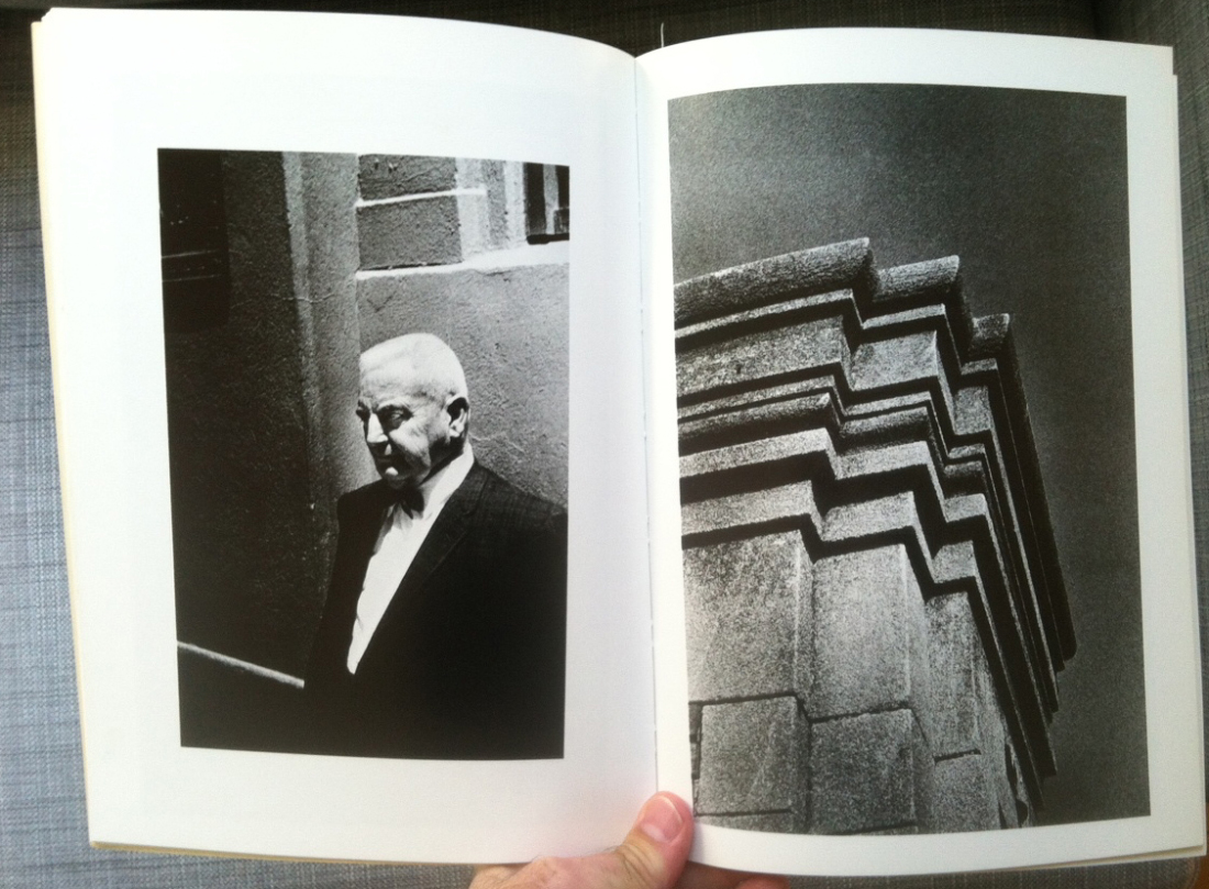
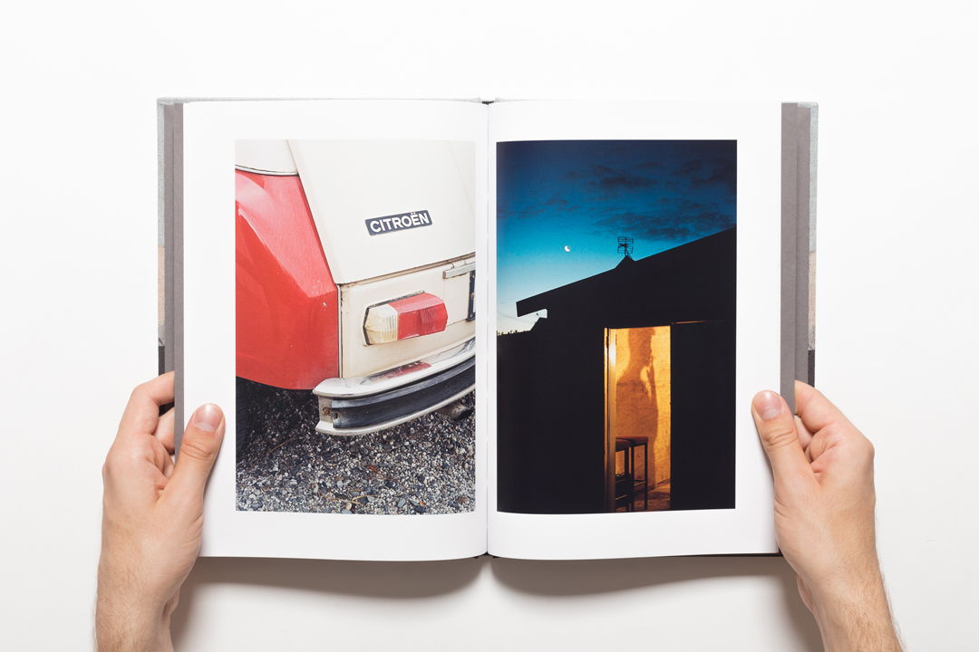
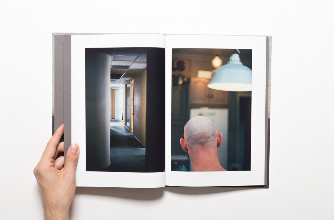
Pairing images is also an important part of the process. Hero images may be strong enough to stand on their own, opposite a blank page, while others might have more impact when contrasted or juxtaposed against another. Sometimes image pairs are based on colour, shape or tone, to highlight a message or evoke a particular response in the reader, but veteran photographer Ralph Gibson describes his secret to pairing images in the video below.
‘By placing a picture on the right and a picture on page left, something must transpire in between the two page spread, the mise-en-page. The essential principle is that the sum will equal more than the total of its parts.’
In his book, Wonderland: A Fairy Tale of the Soviet Monolith, Jason Eskenazi strived for, ‘a dark frame followed by a light frame … on one page you put something on the left, and in the next you put something on the right. You want the viewer to keep looking around the frame to push the viewer through the book’. He also used repetitive shapes and the same entry/exit points to connect pages, ‘where you leave one frame leads you to the starting point of the next … the mood of each image plays into or against the grain of the subsequent image’. Read more at PDN Online.
Size + alignment
You can also play with the size and number of images on a page, the page dimensions, and their comparative ratio. UK photo educator Esther Teichmann encourages photo book creators to ‘move beyond the ratios of photography’, to not assume that a 6×4 image has to be placed on a page with the same ratio. If however, your aim is to produce a traditional book design, this may be a reasonable consideration.
Centering a single image on the page is a popular technique, while a photo spanned across a book’s gutter may draw criticism from traditionalist designers. So too might a photo aligned to the top-edge of a page – for being unbalanced or jarring. If you choose to place multiple images on a page, symmetry and grid designs can be used to maintain visual harmony. In each case these techniques can amplify or reduce the role of an individual photo or create a different personality for the page or the book. The success of the design however, should be measured by whether it reflects what the work demands.
Text + typography
During the thirty or so photo book award judging sessions I’ve witnessed, two questions have inspired much debate. The first question is, ‘does a photobook need text?’ There is no right or wrong answer but, readers who are literate in art theory are less likely to need text, while the average viewer feels more comfortable when text is included as it provides context, and a guide for navigating through the book. If suitable to your book’s purpose, a foreword or opening statement would be helpful at the very least.
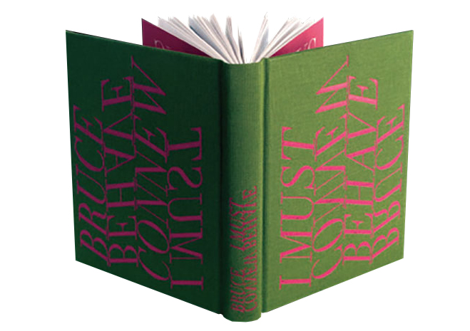
If you do include text, give great consideration to the font, size and placement. Clumsy text can overwhelm the photography, while sophisticated typography can skillfully convey the intention of a photo book as seen in I Must Behave by Auckland-based photographer Bruce Connew. Crafted by his partner, typographer and designer Catherine Griffiths. Griffiths explains that, ‘the typography is a response to the [book’s] over-arching idea of control, and how it modifies behaviour. The ambiguities, the tricks played out in the images … are conveyed in the typographic titling. Throwing the title up on its side causes a behavioural response … I flipped each word, and discovered how neatly this conveyed the content – and intention of the artist’. Read more.
Cover art
The second question that has always inspired much debate is, ‘does a photobook need a photo on the cover?’ Again, there is no right or wrong, but if your aim is to orient the reader and you choose to include a photo on the cover, an establishing shot that clearly sets the scene or reflects the dominant theme of the book seems reasonable. If you choose to go without a photograph, including the book’s title on the cover will give the reader a clue as to what they might find inside, and clever typography can help to express much more.

The cover for the 2017 Australian Photobook of the Year, Variations for Troubled Hands by Steve Carr, was a direct response to the concept of the book, in which a series of 200 images of a ballerina’s hand present a 12 part performance. Designer Wayne Daly, ‘created the cover font based on old ballet-performance posters from the 1950s, then sequenced the letter to emphasise the project’s feeling of movement’. The initial plan to emboss and foil the cover was dropped as they decided simplicity was key, so they, ‘held it back to let it just be what it is’.
Format + form
Design doesn’t stop at the cover. The paper, binding and packaging all contribute to a book’s purpose and intention. Artists like Chloe Ferres see the book as a performative space, playing with its form by cutting or folding pages, adding designs to the fore edge, and encouraging rotation of the page. Others like Ingvar Kenne choose materials that reinforce the narrative. Kenne’s The Hedgehog & the Foxes is presented in a big heavyweight box featuring bold lettering, but the book inside is a small, limp, almost unimpressive softcover – a clever play on the public vs private persona of the book’s protagonist.
Dummy books + print quotes
Finally, you need to produce a dummy book, or a number of them, to ensure that the design successfully translates from the digital realm to the printed form. It is at this stage that many photographers and designers discover that their masterpiece cannot be produced at a price they or their readers can afford, as bells and whistles like gatefolds, multiple sections or stocks, and complex binding are expensive due to the manual labour involved. To avoid disappointment, do your homework upfront and identify your printer’s standard and affordable formats, so you can keep costs in mind as you refine your idea.
Design must support the book’s intention
While this blog post is not a comprehensive guide on photo book design, it provides an overview of design principles and a launchpad for you to learn more. It is most important to understand that there is no right or wrong, but for a well-resolved and engaging book, the design must support the intention of the book, it should never take away from the photography, but it should inspire the viewer to keep turning the pages. In addition to exploring the links in this post, the best way to learn about photo book design is to look at photo books, lots of them, and ask yourself what works and why.
MORE INFORMATION
Photobook design resources
- Structure of the Visual Book by Keith A. Smith (2003)
- Book Design – A Comprehensive Guide by Andrew Haslam, Laurence King Publishing (2006)
- The Dutch Photobook, Aperture (2012)
- The Photobook: A History, Vol.1 by Martin Parr and Gerry Badger, Phaidon (2004)
- The Ten Golden Rules of Photobook Design by Sybren Kuiper
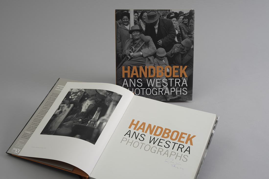
Australian photo book designers
- Heidi Romano (photographer and designer)
- Ralph Kenke
- Kathie Eastway
- Mark Gowing
- Douwe Dijkstra (photographer and designer)
New Zealand photo book designers
- Neil Pardington (photographer and designer)
- Catherine Griffiths (designer and typographer)
- Layla Tweedie Cullen of split/fountain
- Jonty Valentine of index
International photo book designers
Momento Pro photo book print service
Momento Pro is a photobook print-on-demand service based in Sydney, Australia. They have been producing premium hardcover and softcover photo books for Australian and New Zealand photographers and artists since 2004, in quantities of one up to 250 copies. View their design tools and specifications, standard photo book range, volume service and custom quote form here. To learn more visit momentopro.com.au or momentopro.co.nz.


Thanks for sharing this informative information!